Hopeful for great student presentations!

One day, I'd really like to see an erupting volcano. Yes, I'm planning at some point to visit Hawai'i and see Kilauea erupting in classic basaltic shield volcano style, but I'd really like to see a massive, ash cloud, explosive, Plinian eruption. Of course, I'd like the guarantee of being perfectly safe in doing so. 🙂

Kilauea Eruption

We're covering volcanoes in class right now, and as a cumulative project for the volcanic activity topic, I have each student select a different volcano (I provide a list of volcanoes that have either been active fairly recently or have had some spectacular eruptions in the past), and then create a presentation as if they were a travel agent trying to "sell" a trip to their volcano to adventure travelers. They're required to have specific information about the type of volcano it is, how it erupts, etc., but they're highly encouraged to take it to the next level by including trip itineraries, cool things to do near the volcano, and so forth.In the past I've been deluged with presentations from bullet-point hell in which students simply read directly off their slides. It stinks sitting through one 5-minute presentation like that. Imagine sitting through 85-90...yeah, I was going crazy by the end of the presentations- trying as hard as I could to not punish students going later for my self-created forced torture of watching poorly designed presentations for four class periods.

This year, I made a small (but extremely significant) change. I told them they could only have 2 words MAX on each slide- and it'd be fine with me if their presentation contained no text at all (except for citations, of course). I mean it too. Most students created a title slide that looked something like this:

Nope. Can't do that. Volcano name, plus "by: your name" counts as four words (I did concede that the name of their volcano only counts as one word, otherwise whoever covers Mount St. Helens wouldn't even be able to put the name of their volcano on a slide). The classes are in the middle of designing their presentations right now, and it's been a struggle for them:

"How can I give a presentation with no words?"

"You mean I have to memorize everything?"

"What do you mean 'of' is a word? That shouldn't count, it's barely two letters!"

Students can have note cards with information for the presentations with them while they present, so they don't have to memorize, though it's amazing to me that they've been so "well"-trained at designing poor presentations. Students are still in the middle of designing presentations as I type this, and I must say they're looking pretty promising. I'll let you know how they turn out!

Resources:


Image Credit: Kilauea in 1993 from the USGS

Blogged with the Flock Browser

Tags: , , , , , , ,

Tropical Storm and Hurricane Frequency

September, 2005: The school year has just begun. The country is still reeling from Hurricane Katrina.

Instead of beginning the year covering plate tectonics (my original plan), I decide to start with hurricanes. As we learn more about Katrina and hurricanes in general, the question keeps coming up in class (and in the media): "Are we getting more hurricanes because of global warming?"

I struggled with how to answer that question. Reports from scientists were mixed. The most reliable sources (IMHO) never made a direct connection between global warming and the trend of more active hurricane seasons. They'd only go as far as something similar to, "hurricanes get their power from warm oceans. In theory, if oceans get warmer, it would make sense we'd see more hurricanes."

That didn't cut it for my students. 15-year olds don't have great appreciation for the subtleties and complexities of meteorological research. They wanted answers.

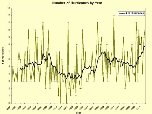
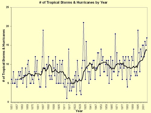
I stumbled across a website containing records of every reported hurricane and tropical storm from 1851 on. Aha! Oho! Forget the experts, let's track the trends ourselves!

I split the class into groups. Each group took a decade and recorded the number of hurricanes and tropical storms each year in their decade. Back in the pre-Google Docs era, we were forced to spend 30 minutes or so sharing data and entering into their individual spreadsheets. Today, just create a Google Doc spreadsheet (like this one!) and have each group enter their data (an example of collaborative online documents saving a huge amount of time & boredom).

Then comes the graphing! . I've found Google Docs graphs aren't too great at this now (they might get there soon), but exporting the data to Excel is easy enough.

We added moving average trendlines to see the trends. You can play with how long the moving average should be. We decided that 5-10 years seemed to give a good picture of the trends. The graphs below have trendlines with a moving average of 10 years.

The graphs:

Hurricanes by Year

Tropical Storms + Hurricanes per Year

Fun fact: The first time I saw these graphs was in class (and my students knew that). I didn't know what trends would emerge. My students and I were learning together, and they seemed to like participating in the discovery of something that wasn't pre-determined.

Good discussions that fit well with this activity

  • How valid are the counts and intensities for tropical storms before reliable weather satellites and radar were in use? Most storm reports back in the day simply came from ships at sea. How would the data be affected if several storms went unreported each year?
  • Does this information prove causality? (It doesn't) As much as it looks like it, there's no way we can say with any certainty that global warming has caused the uptick in tropical storms recently.
  • Would coastal development have occurred at the same rate the last 50 years if hurricanes were as frequent as they have been the last few years? Lots of good discussion can be had as to the wisdom of living on the coast, students seem to have strong opinions one way (you'd be stupid to do this) or another (It's way worth the risk to live on the ocean).

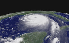
Whew. I'm feeling a bit like this guy. What can I say? I'm a fan. Comment it up!

Image credit: NOAA via GISUser.com on Flickr

Blogged with the Flock Browser

Tags: , , , , , , ,

Getting to the Point (#2)

When I started this blog, I intended to use it to communicate two things:

  1. My thoughts and and reflections on technology in the classroom
  2. Lessons and examples from classes I've taught

In reviewing my posts, I realized I haven't really done much of #2. My posts have all been #1's. So starting today, I'm going to try to add at least one post a week of actual examples direct from my class.

I want to share this information because: 1) Maybe you'll find it useful for classes you're teaching, or 2) I'd like feedback on extensions & ways to improve what I'm doing.

Don't be afraid to leave (constructive) criticisms in the comments. You're always welcome to leave comments that tell me how wonderful I am.
(isn't that the point?)
Image by Placbo, via Flickr

Blogged with the Flock Browser

Tags: , ,